This is the fourth part in the my series about building an Android app using Xamarin.Android. You can find the first part here, the second part here and the third part here, and I highly recommend reading these first.
Binding our view models to the UI
We have our models, we have our view models, now to work on the views! First thing we need to do is a bit of a tidy up - the default UI code we’ve picked up from our templates doesn’t match what we want to show in screen, so lets start by clearing everything up a bit.
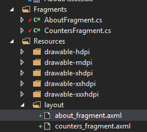
The UI we have has a navigation drawer with 2 screens you can select, as well as some sub menu options. The screen selection options load one of two possible fragments into our UI. We can repurpose these - one fragment to show our counters and one to show an about screen so we can tell the world who created such a stupendous counter app!
Stating with the first fragment we can rename the class from Fragment1 to CountersFragment, as well as renaming the associated layout from fragment1.axml to counters_fragment.axml. After renaming the layout file we also need to change the id that is used in the CountersFragment.OnCreateView method to reflect the new name:
return inflater.Inflate(Resource.Layout.counters_fragment, null);
For the second one we can rename it from Fragment2 to AboutFragment and fragment2.axml to about_fragment.axml, and again updating the id:
return inflater.Inflate(Resource.Layout.about_fragment, null);
Now is also a good time to update the menu in menu\nav_menu.xml to remove the unwanted sub items and rename the main items:
<?xml version="1.0" encoding="UTF-8" ?>
<menu xmlns:android="http://schemas.android.com/apk/res/android">

  <group android:checkableBehavior="single">
    <item
        android:id="@+id/nav_counters"
        android:icon="@drawable/ic_add_circle_black_48dp"
        android:title="Counters" />
    <item
        android:id="@+id/nav_about"
        android:icon="@drawable/ic_settings_black_48dp"
        android:title="About" />
  </group>

</menu>
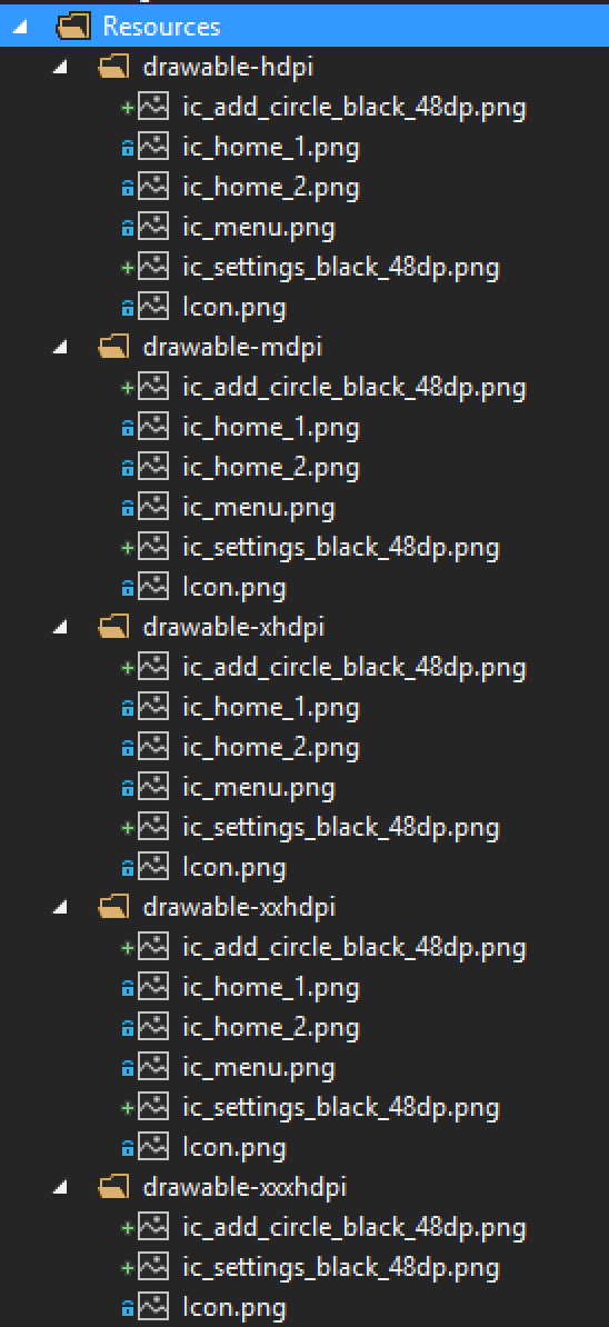
You’ll notice the icons have changed to items not in our drawables folder, so we’ll need to add these. The icons we’re using are from the Google material icons - you can download them from https://design.google.com/icons/. You’ll need to download the ‘add circle’ and ‘settings’ icons as pngs and copy them from the drawables folders of the downloads to the same named drawables folders locally, then add them to the project.
Changing the menu ids will break our MainActivity so we need to fix the OnCreate method by changing the subscription to the NavigationView.NavigationItemSelected event. At the same time we can remove the snack bar call as we don’t want one popping up when we change the fragment.
navigationView.NavigationItemSelected += (sender, e) =>
{
    e.MenuItem.SetChecked(true);

    switch (e.MenuItem.ItemId)
    {
        case Resource.Id.nav_counters:
            ListItemClicked(0);
            break;
        case Resource.Id.nav_about:
            ListItemClicked(1);
            break;
    }

    drawerLayout.CloseDrawers();
};
CountersFragment
In this fragment we want to display a list of all the counters that we have stored. The latest and greates way to do this is with a RecyclerView which is documented here on the Xamarin docs. This is like a list view but enforces good design and ensures the views created are always re-used when they go off screen reducing the memory footprint. It also enforces the use of the view holder pattern to futher improve performance.
To use the recycler view we need to add a nuget package to our StupendoudCounter.Droid project - Xamarin.Android.Support.v7.RecyclerView. This provides the recycler view for all versions of Android from API level 7 and above.

Once we have our nuget package installed we can add the recycler view to our UI and create it’s backing field. In counters_fragment.axml add the recycler view:
<?xml version="1.0" encoding="utf-8"?>
<LinearLayout xmlns:android="http://schemas.android.com/apk/res/android"
    android:orientation="vertical"
    android:layout_width="fill_parent"
    android:layout_height="fill_parent">
  <android.support.v7.widget.RecyclerView
      android:id="@+id/countersRecyclerView"
      android:scrollbars="vertical"
      android:layout_width="fill_parent"
      android:layout_height="fill_parent" />
</LinearLayout>
In CountersFragment add a field for the recycler view and find it from the view in the OnCreateView method:
using Android.Support.V7.Widget;

...

private RecyclerView _recyclerView;

public override View OnCreateView(LayoutInflater inflater, ViewGroup container, Bundle savedInstanceState)
{
    var ignored = base.OnCreateView(inflater, container, savedInstanceState);
    var view = inflater.Inflate(Resource.Layout.counters_fragment, null);
    _recyclerView = view.FindViewById<RecyclerView>(Resource.Id.countersRecyclerView);
    return view;
}
To use this recycler view we need to use or implement a few things:
- A layout manager
- An adapter
- A view holder
Layout manager
Each instance of a recycler view has a layout manager - this determines how the items in the view are laid out. Android provides 3 basic ones which are good enough for most cases, but you can implement your own if you wish. There’s LinearLayoutManager which displays the items in a horizontal or vertical list, GridLayoutManager that displayes the items in a grid and StaggeredGridLayoutManager which displays them in a grid with uneven rows or columns.
For what we need the LinearLayoutManager is good enough, so we can create one and set it on our recycler view:
_recyclerView.SetLayoutManager(new LinearLayoutManager(Context, LinearLayoutManager.Vertical, false));
The three parameters for the constructor are the current context which we can get from the Context property, the orientation for which we are using the Vertical constant defined on LinearLayoutManager, and a boolean to say if the items should be reveresed or not when we show them - so should we show the items in our list from top to bottom, or bottom to top (reverse is useful when adding new items to the end of a list but showing them in latest-first order, such as an email client order by date).
Adapter
The adapter’s job is to act like a view model for the recycler view - it needs to know about the collection of items we are showing in the list and be able to tell the recycler view how many there are and needs to be able to create the views for items in the collection where necessary or recycle them to be used by other items in the collection.
All adapters need three things - a class derived from RecyclerView.Adapter, a view to create to show the item and a view holder that maps the items in the collection to the view. To create the adapter create a class called CountersAdapter:
using Android.Support.V7.Widget;
using Android.Views;
using StupendousCounter.Core.ViewModel;

namespace StupendousCounter.Droid.Fragments
{
    public class CountersAdapter : RecyclerView.Adapter
    {
        public override void OnBindViewHolder(RecyclerView.ViewHolder holder, int position)
        {
            var item = ViewModelLocator.Counters.Counters[position];
            ((CounterViewHolder) holder).BindCounterViewModel(item);
        }

        public override RecyclerView.ViewHolder OnCreateViewHolder(ViewGroup parent, int viewType)
        {
            var itemView = LayoutInflater.From(parent.Context).Inflate(Resource.Layout.counter_view, parent, false);
            return new CounterViewHolder(itemView);
        }

        public override int ItemCount => ViewModelLocator.Counters.Counters.Count;
    }
}
When we override RecyclerView.Adapter we have to implement three things - ItemCount, OnCreateViewHolder and OnBindVewHolder.
ItemCount just needs to return the number of items in the collection. This just returns the count from the CountersViewModel instance from the static ViewModelLocator.
OnCreateViewHolder is called whenever an item in the recycler view is created for the first time. This needs to create a view and wrap it in a class derived from RecyclerView.ViewHolder.
OnBindViewHolder is responsible for updating the view holder to reflect the relevant item in the collection. The item is given by the position parameter - this indicates the position in the collection of the item we need to show in the view. In our code we are using this to get the item from our view model which we access using the static ViewModelLocator, and this is passed to a method on the view holder to populate it. In a lot of code you will see the view holder updated directly here with the controls in the view holder exposed as public properties, but I prefer to encapsulate the controls inside the view holder and have a single method to call to update the view. This means if the view changes the adapter doesn’t need to change.
These last two are the basis of how the recycler view works - it calls OnCreateViewHolder to create just enough views to fill the screen, then calls OnBingViewHolder to show the data. As the collection is scrolled instead of creating new views, the views that are no longer visible are re-used. So if you scroll down a a view disappears off the top it is moved to the bottom to remove the overhead of creating a new view. To make sure it shows the right data OnBindViewHolder is called to update the view to show the correct data.
To create the view add a new layout called counter_view.xml:
<?xml version="1.0" encoding="utf-8"?>
<android.support.v7.widget.CardView xmlns:android="http://schemas.android.com/apk/res/android"
    xmlns:card_view="http://schemas.android.com/apk/res-auto"
    android:layout_width="match_parent"
    android:layout_height="wrap_content"
    card_view:cardElevation="8dp"
    card_view:cardCornerRadius="8dp"
    android:layout_marginLeft="8dp"
    android:layout_marginRight="8dp"
    android:layout_marginTop="8dp">
    <GridLayout
        android:minWidth="25px"
        android:minHeight="25px"
        android:layout_width="match_parent"
        android:layout_height="wrap_content"
        android:columnCount="3"
        android:rowCount="1">
        <TextView
            android:id="@+id/counter_value"
            android:layout_width="wrap_content"
            android:layout_height="wrap_content"
            android:text="10"
            android:layout_row="0"
            android:layout_column="1"
            android:textSize="48sp"
            android:layout_gravity="center_vertical"
            android:layout_marginRight="16sp"
            android:textColor="@color/primaryDark" />
        <ImageButton
            android:id="@+id/counter_increment"
            android:layout_width="wrap_content"
            android:layout_height="wrap_content"
            android:layout_row="0"
            android:layout_column="2"
            android:layout_gravity="center_vertical"
            android:layout_margin="16sp"
            android:src="@drawable/ic_add_circle_black_48dp"
            android:background="#00000000"/>
        <LinearLayout
            android:orientation="vertical"
            android:layout_gravity="fill"
            android:layout_row="0"
            android:layout_column="0"
            android:padding="16sp">
            <TextView
                android:id="@+id/counter_name"
                android:layout_width="wrap_content"
                android:layout_height="wrap_content"
                android:text="Name"
                android:padding="4sp"
                android:textSize="24sp"
                android:textColor="@color/primaryText" />
            <TextView
                android:id="@+id/counter_description"
                android:layout_width="wrap_content"
                android:layout_height="wrap_content"
                android:text="The counters description"
                android:padding="4sp"
                android:textSize="16sp" />
        </LinearLayout>
    </GridLayout>
</android.support.v7.widget.CardView>
This view uses a CardView which is documented here on the Xamarin docs. Inside the CardView there is a GridLayout and LinearLayout to layout the various widgets, three TextViews to show the counter details and value, and an ImageButton to allow the counter to be incremented. The view looks like this:
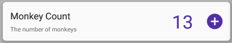
The GridLayout is used to layout 3 columns - one for the counter details, one for the count and one for the increment button. Inside the first column is the LinearLayout that shows the counters name and description as a vertical layout.
ViewHolder
The view holder’s job is to create backing fields for the controls in the view to improve performance by only having to find the controls by id once per instance of the view. To create the view holder create a class called CounterViewHolder:
using System;
using System.ComponentModel;
using Android.App;
using Android.Graphics;
using Android.Support.V4.Content;
using Android.Support.V7.Widget;
using Android.Views;
using Android.Widget;
using StupendousCounter.Core.ViewModel;

namespace StupendousCounter.Droid.Fragments
{
    public class CounterViewHolder : RecyclerView.ViewHolder
    {
        private readonly TextView _name;
        private readonly TextView _description;
        private readonly TextView _value;

        private CounterViewModel _counterViewModel;

        public CounterViewHolder(View itemView) : base(itemView)
        {
            _name = itemView.FindViewById<TextView>(Resource.Id.counter_name);
            _description = itemView.FindViewById<TextView>(Resource.Id.counter_description);
            _value = itemView.FindViewById<TextView>(Resource.Id.counter_value);

            var increment = itemView.FindViewById<ImageButton>(Resource.Id.counter_increment);
            increment.SetColorFilter(new Color(ContextCompat.GetColor(Application.Context, Resource.Color.primaryDark)));
            increment.Click += IncrementOnClick;
        }

        private void IncrementOnClick(object sender, EventArgs eventArgs)
        {
            _counterViewModel.IncrementCommand.Execute(null);
        }

        public void BindCounterViewModel(CounterViewModel counterViewModel)
        {
            if (_counterViewModel != null)
                _counterViewModel.PropertyChanged -= CounterViewModelOnPropertyChanged;

            _counterViewModel = counterViewModel;
            _counterViewModel.PropertyChanged += CounterViewModelOnPropertyChanged;

            _name.Text = counterViewModel.Name;
            _description.Text = counterViewModel.Description;
            _value.Text = counterViewModel.Value;
        }

        private void CounterViewModelOnPropertyChanged(object sender, PropertyChangedEventArgs args)
        {
            if (args.PropertyName == nameof(CounterViewModel.Value))
                _value.Text = _counterViewModel.Value;
        }
    }
}
This class derives from RecyclerView.ViewHolder. In the constructor a view is passed in - and this is the view created by our adapter. In here we are manually going to wire up the values for the counter view model to the view. Although we are using MVVMLight for our view models which exposes a binding mechanism this currently doesn’t work with view holders (although Laurent tells me it should do in a couple of weeks time so stay tuned for an update), so we have to do it all manually.
The first thing we do is grab the name, description and value text edit fields and store these. FindById is slow, hence why we only want to do this once per view instance and store the found controls.
For the image button we don’t need to store it in our class, we just need to wire up the Click event so we can respond to it. We also call SetColorFilter on the button - this is because the icon that was downloaded from Google material design images is a black button and we want it to match our theme. SetColorFilter will change the colour of the button to the given colour, giving a nice purple button.
In the adapter in the OnBindViewHolder method we delegated the updating of the UI to a method on the view holder, and this is implemented here in the BindCounterViewModel method. This method takes a CounterViewModel that refers to the item in the relevant position in the collection, and this is stored in a field. The name, description and value controls are updated to match the view model. We also subscribe to the PropertyChanged event so that the value can be updated when it changes on the view model - such as when the increment button is pressed. To avoid the wrong counters being incremented we also unsubscribe from this event from the view model stored in our field if it is set before we update it to store the one passed in.
Once the view model is stored, we can increment it when the increment button is clicked. In the click event handler (IncrementOnClick) we execute the IncrementCommand which will cause the value to increment and be updated in SQLite as shown in the previous post. This will also cause the PropertyChange event to be fired for the Value property, which we handle and update the UI to reflect the new value.
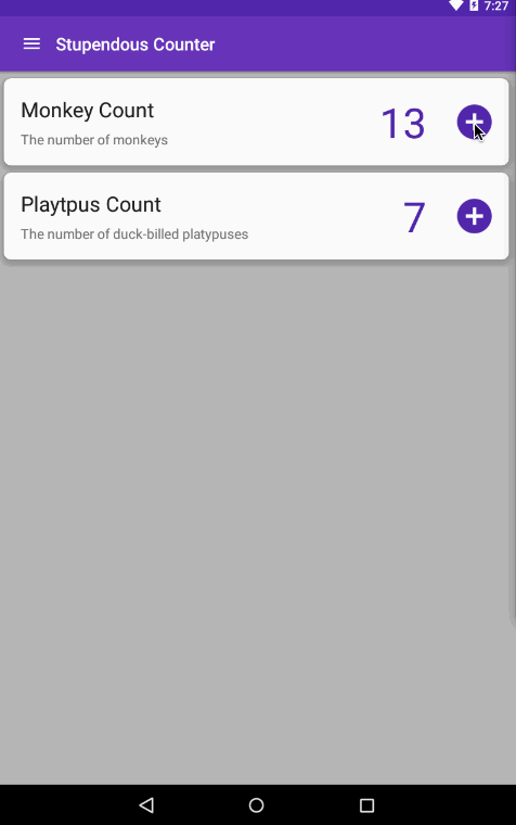
Lets try it out
That should be everything we need to do to show some dummy data and increment the counters, so lets build it, run it and try it out. Click on the plus button to increment each counter, then try closing and re-opening the app - you’ll notice the values are persisted thanks to our SQLite db.
The code for this can be found in GitHub on the Part4 branch at https://github.com/jimbobbennett/StupendousCounter/tree/Part4
In the next part we’ll work on adding an Add button to add a new counter.
Continuing on from the last post where I mentioned what I was listening to whilst developing, today I'm listening to Sleeping at Last Note - these are an affiliate links - if you click them and buy I get a small cut. |